


Master styling colorful gemstone jewelry with 7 proven techniques for layering, color matching, and outfit coordination. Learn to elevate any look.
7 Ways to Style Colorful Gemstone Inspired Jewelry
Oct 26, 2026

Last Updated: October 26, 2026
Quick Summary
Colorful gemstone jewelry shines when you understand color relationships, complementary colors create visual pop, analogous colors feel harmonious, and triadic colors look balanced. Use the 60-30-10 intensity ratio with one dominant stone, a supporting stone, and a small accent, then match metal to your stone's temperature for a polished, intentional look.
- Complementary colors sit opposite on the color wheel and create maximum visual pop for focal-point pieces.
- The 60-30-10 proportion applies to color intensity: 60% dominant stone, 30% supporting stone, 10% accent piece.
- Warm stones like ruby and citrine pair beautifully with gold finishes, while cool stones like sapphire and emerald shine in silver or white metal.
- Layer necklaces using length variation, 14 inches, 18 inches, and 22 inches, to prevent tangling and keep each piece visible.
- Cool undertones suit sapphire, emerald, and turquoise; warm undertones suit ruby, citrine, and garnet; neutral undertones work with most stones.
Table of Contents
- Understanding Color Theory for Colorful Gemstone Jewelry
- How to Mix Gemstone Colors Without Clashing
- How to Style a Gemstone Pendant With Different Necklines
- Layering Colorful Necklaces for Maximum Impact
- Colorful Jewelry Outfit Ideas for Every Occasion
- Stacking Bracelets and Rings With Colorful Stones
- Finding Your Perfect Colorful Gemstone Combination
- Frequently Asked Questions
Understanding Color Theory for Colorful Gemstone Jewelry
Understanding how colors work together transforms random pieces into cohesive looks when styling colorful gemstone jewelry.
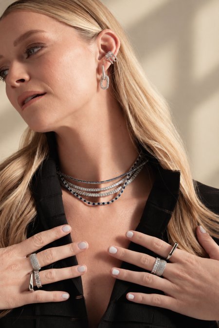
An emerald-green pendant with sapphire-blue or ruby-red stones creates sophisticated visual tension, while same-family stones like turquoise with aquamarine give a refined, monochromatic effect.
Start by identifying your dominant stone color. Then choose one of three approaches:
- Match the temperature: Warm stones (ruby, citrine, garnet) pair beautifully with gold finishes. Cool stones (sapphire, emerald, turquoise) shine in silver or white metal.
- Play with contrast: A warm stone against cool metal creates deliberate drama. A cool stone in warm gold feels unexpected and modern.
- Build a palette: Choose two or three stone colors that work together, then stick with those across multiple pieces.
At Denise Pacini, we design colorful gemstone inspired jewelry to layer and mix freely, so you can build your own color story without overthinking it.
How to Mix Gemstone Colors Without Clashing
A repeatable three-step method lets you mix almost any stones with confidence.
Step 1: Pick your color relationship
Every successful gemstone mix uses one of three color-wheel relationships. Choose one first.
- Complementary (opposites): Ruby-red with emerald-green, sapphire-blue with citrine-yellow, amethyst-purple with citrine-yellow. These pairs create maximum visual pop. Use them when you want one piece to be the clear focal point.
- Analogous (neighbors): Turquoise with aquamarine, emerald with peridot, ruby with garnet. These feel harmonious and low-risk. They are the easiest entry point if you are new to color mixing.
- Triadic (evenly spaced): Emerald-green, sapphire-blue, and ruby-red form a classic triad. So do amethyst, citrine, and turquoise. Triads look balanced but bolder than analogous pairs, so keep the rest of the outfit quiet.
Pick the relationship first, then choose stones that fit it, that sequencing prevents most clashing.
Step 2: Set your intensity ratio
Control how loud the mix reads with the 60-30-10 proportion, applied to color intensity rather than surface area:
- 60%, dominant: Your main stone color, usually the largest or most central piece (a necklace or statement ring).
- 30%, supporting: A stone in the same relationship family, in a smaller or thinner piece.
- 10%, accent: One small pop of contrast, often a ring or earring.
If your dominant stone is highly saturated, a vivid ruby or emerald, keep supporting and accent pieces quieter. If it is softer (rose quartz, aquamarine, moonstone), you can push the supporting color brighter.
Pro Tip
A quick test: squint at your outfit in a mirror. If you can still tell which piece is the focal point, your ratio is working. If everything blends into one bright mass, reduce the accent piece.
Step 3: Match metal to stone temperature
Metal is the most-ignored variable, and it changes how a stone reads more than any other choice.
- Warm stones (ruby, citrine, garnet, carnelian) intensify against yellow gold and can look sharper against white metal.
- Cool stones (sapphire, emerald, turquoise, aquamarine) look crisp in white metal or silver and feel richer against rose gold.
- Neutral stones (pearl, moonstone, clear quartz) act as a bridge and let you mix metals more freely.
Mixing metals is fine, but do it once per look. Warm gold on the neck with cool silver on the wrist reads as deliberate; three finishes reads as accidental. If you are new to mixing, keep metal consistent and let the stones carry the color story.
A practical starting sequence
- Choose one relationship: complementary, analogous, or triadic.
- Pick a dominant stone and set it as your 60%.
- Add one supporting stone in the same family at 30%.
- Add a single 10% accent, or skip it entirely.
- Match metal to the dominant stone's temperature.
- Wear neutral clothing so the jewelry carries the color.
Once that feels automatic, introduce a second relationship in a different zone, an analogous necklace with a complementary ring, and keep everything else quiet.
Watch Out
The most common mixing mistake is not too much color, it is too many focal points. Two statement pieces in competing colors fight each other. Let one piece lead and make the rest support it.
At Denise Pacini, we design colorful gemstone inspired jewelry so pieces across collections share compatible stone palettes and metal finishes, follow this method across necklaces, bracelets, and rings without guessing.
These three color-wheel relationships form the foundation of any successful gemstone mix.
| Color Relationship | Examples | Best For |
|---|---|---|
| Complementary (opposites) | Ruby-red with emerald-green, sapphire-blue with citrine-yellow | Maximum visual pop and clear focal points |
| Analogous (neighbors) | Turquoise with aquamarine, emerald with peridot | Harmonious, low-risk mixing for beginners |
| Triadic (evenly spaced) | Emerald-green, sapphire-blue, ruby-red | Balanced, bold looks with quiet outfits |
How to Style a Gemstone Pendant With Different Necklines
Your neckline determines how much of a gemstone pendant shows and how it interacts with your silhouette.
V-necks and scoop necks create vertical lines that guide the eye toward the stone.
Crew necks and turtlenecks call for shorter pendants or delicate chains, a long pendant gets swallowed by high necklines.
Off-shoulder and bardot necklines expose your collarbone and shoulders, so they handle bolder pendants.
Strapless and sweetheart necklines already make your shoulders and collarbone a focal point.
You can explore our Samira 2MM Colored Tennis Necklace Silver to see how a refined gemstone pendant works across different necklines in your own styling.
Layering Colorful Necklaces for Maximum Impact
Layering colorful necklaces is where colorful gemstone jewelry truly shines, creating depth and intentional curation.
The foundation is length variation: one pendant at 14 inches, another at 18, a third at 22.
Here's a tested layering formula:
- Layer 1 (shortest, 14-15 inches): Delicate chain or thin pendant
- Layer 2 (medium, 18-19 inches): Your statement piece with bold color or presence
- Layer 3 (longest, 22-24 inches): A fine chain or subtle accent
The shortest piece draws the eye first, the middle anchors the look, and the longest adds dimension.
Metal consistency matters when layering.
For deeper guidance on necklace layering techniques, check out our guide on how to layer tennis necklaces daily.
Celine Colorful CZ Baguette Tennis Necklace →
Colorful Jewelry Outfit Ideas for Every Occasion
Office and Professional Settings: Pair a delicate colorful gemstone jewelry piece with structured, neutral clothing.
Casual Weekend Looks: Layer multiple pieces for a relaxed, curated feel, a colorful pendant over a white t-shirt with jeans, plus a thin bracelet in a complementary stone color.
Evening and Special Events: Go bold.
Casual Dinner Dates: Mix a statement necklace with one accent piece, a ruby-inspired pendant with a single turquoise ring creates balance.
Beach and Resort Wear: A turquoise-inspired tennis necklace over a white linen shirt feels fresh and coastal.
Stacking Bracelets and Rings With Colorful Stones
Bracelet stacking follows the same principles as necklace layering but with more freedom.
Start with a statement piece, your boldest, most colorful bracelet. Then add supporting pieces in complementary or analogous colors.
Width variation prevents visual monotony: pair a 6mm tennis bracelet with a 3mm bangle and a 2mm chain bracelet for rhythm.
You can explore our Veda Multicolor Simulated Diamond Ring to see how these pieces work together in a cohesive stack.
Here's a simple stacking formula:
- Dominant piece: Your boldest, most colorful bracelet or ring
- Supporting piece 1: Complementary color, thinner width
- Supporting piece 2: Analogous color or neutral, minimal design
More than four pieces on one wrist can feel crowded. If you want more color, split pieces between wrists or save additional pieces for necklaces and rings.
Finding Your Perfect Colorful Gemstone Combination
Most styling guides stop at "wear what feels right", not useful when you're deciding between a sapphire pendant and a citrine one. Personal coloring, undertone, contrast, and metal preference, narrows the field fast. Use this framework to move from a hundred options to a short list.
Step 1: Identify your undertone
Undertone is the base hue under your skin and does not change with tanning. A common at-home check is the vein test: look at the veins on the inside of your wrist in natural light.
- Veins that read blue or purple usually point to a cool undertone.
- Veins that read green or olive usually point to a warm undertone.
- A mix of both, or hard-to-tell veins, usually points to a neutral undertone.
A second check: hold a pure white shirt and a cream shirt near your face in daylight. If white flatters you more, lean cool; if cream flatters you more, lean warm; if both work, you are likely neutral.
Step 2: Match stones to undertone
This is a starting point, not a rule, but it removes most of the guesswork.
- Cool undertones: Sapphire, emerald, turquoise, amethyst, aquamarine, and blue topaz tend to look crisp and clear. White metal and silver usually reinforce the effect.
- Warm undertones: Ruby, citrine, garnet, carnelian, peridot, and warm-toned pearls tend to glow. Yellow gold usually reinforces the effect.
- Neutral undertones: Most stones work. Neutral undertones can wear both warm and cool palettes and are the easiest group to mix metals with.
If a stone you love sits outside your palette, wear it in a smaller piece, a ring or stud earring, rather than as the dominant necklace; smaller surface area makes an off-palette color read as an accent instead of a clash.
Step 3: Factor in contrast level
Contrast is the difference between your skin, hair, and eyes. It matters as much as undertone and is the variable most guides skip.
- High contrast (for example, fair skin with dark hair, or deep skin with very light eyes): bold, saturated stones and clear color blocking tend to look striking. You can carry a vivid ruby or emerald as a focal point.
- Low contrast (skin, hair, and eyes close in value): softer, tonal stones, rose quartz, moonstone, aquamarine, muted pearls, tend to look more harmonious. Very saturated stones can overpower a low-contrast look unless you keep them small.
- Medium contrast: You have the most flexibility. Build a look around one saturated piece and keep the rest tonal.
A useful rule of thumb: the higher your natural contrast, the more saturated your jewelry can be before it competes with your face.
Step 4: Choose metal that supports the stone
Metal isn't just a finish, it changes how a stone reads.
- Yellow gold warms up cool stones and intensifies warm ones. It is the most flattering choice for warm undertones and warm stones.
- White gold and silver cool down warm stones and sharpen cool ones. They suit cool undertones and high-contrast looks.
- Rose gold sits between the two and flatters most neutral undertones. It pairs especially well with pink and purple stones like rose quartz and amethyst.
If you mix metals, do it in two zones maximum, a gold necklace with a silver ring, for example, and keep the stones in a single relationship family so the look stays intentional.
Step 5: Filter by lifestyle and occasion
Personal coloring narrows the palette; lifestyle narrows the format.
- Conservative workplaces: Start with a single-stone pendant in your best color at 16-18 inches, plus stud earrings. Add color through one accent ring.
- Creative or casual settings: Layer an analogous pair, turquoise and aquamarine, for example, and add a complementary accent on the hand.
- Frequent formal events: Invest in one saturated statement piece in a jewel tone (emerald, sapphire, ruby) and build supporting pieces around it.
Step 6: Apply the proportion check
Before committing to a combination, run a proportion check: the goal is one focal point per look.
- One statement piece (a bold necklace, a large ring, or a chunky bracelet), not two.
- Supporting pieces should be thinner or smaller than the focal piece by at least one step in width.
- Neckline and outfit detail should not compete with the jewelry. A high-detail neckline plus a statement necklace is one focal point too many.
Key Takeaway
The fastest way to find your combination is to work in this order: undertone → contrast → metal → occasion → proportion. Each step cuts the field roughly in half, and by the end you are choosing between two or three pieces instead of a hundred.
Visit our Color Collection to browse curated combinations by stone family and metal finish, and use the framework above to shortlist pieces that fit your undertone, contrast level, and daily routine. When you are ready to care for your pieces, learn how to clean gemstone-inspired jewelry so the colors stay vivid for years.
The power of styling colorful gemstone inspired jewelry lies in choices that feel authentically yours: color theory provides structure, undertone and contrast provide direction, and proportion provides the final check. The perfect combination makes you feel bold, confident, and completely yourself, and that is what Denise Pacini jewelry is designed for.
Frequently Asked Questions
How do you mix different gemstone colors in one outfit?
Start with a dominant color (one colorful gemstone piece as your focal point), then add complementary or analogous colors in smaller doses. For example, pair an emerald-toned pendant with turquoise stacked rings, or combine sapphire and ruby stones in layered necklaces. The key is varying the scale: let one piece command attention while others support it. This prevents visual chaos while celebrating colorful gemstone jewelry.
Can you wear different colored gemstones together?
Yes, absolutely. Complementary colors (opposites on the color wheel, like emerald and ruby) create bold contrast, while analogous colors (neighbors on the wheel, like sapphire and turquoise) offer harmony. The Celine Colorful CZ Baguette Tennis Necklace showcases multiple stone tones in one continuous design, proving that mixing gemstones works beautifully when you balance scale, metal tone, and occasion.
What colors go well with colorful jewelry?
Neutral clothing (white, black, beige, gray, navy) lets colorful gemstone jewelry shine without competing. Soft pastels also pair well if your stones lean cool-toned (sapphire, turquoise). For warm-toned stones like ruby or citrine, earth tones and warm neutrals create harmony. Consider your skin undertone too: cool undertones pair beautifully with sapphire and emerald, while warm undertones complement ruby and turquoise-inspired pieces.
How do you layer colorful necklaces without making them look busy?
Vary chain lengths (16", 18", and 20" are ideal starting points) so each necklace sits at a different depth on your chest. Stick to 2-3 pieces maximum, and ensure at least one is delicate while another makes a statement. Mix metals thoughtfully: gold with gold, silver with silver, or intentionally blend them if your outfit justifies it. The Samira 2MM Multicolor Simulated Diamonds Tennis Necklace works beautifully layered with minimalist chains for refined visual interest.
